5 design principles we use to put creators center stage
Aug 13, 2026 [[read-time]] minute read
Aug 13, 2026 [[read-time]] minute read
Building an app for billions of people means every pixel counts. Our ultimate goal is for the YouTube interface to support our creators’ content, letting their videos take center stage. To get there, we're constantly making thoughtful refinements to reduce clutter and make the app feel effortless to use.
To ensure the platform gets more intuitive over time, without turning your hard-earned muscle memory upside down, our teams rely on five core design principles:
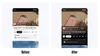
Watch page that puts the creator center stage.
The interface shouldn't compete with the video you're trying to watch. We’re quieting the visual noise by removing intrusive elements. For example, we’ve moved product overlays that could obstruct creators’ content to a cleaner shelf below the player, making the creator’s work the undeniable focus.

More pixels dedicated to the video on Shorts.
We want to make sure the features you see are actually the ones you use. If a button or menu isn’t immediately helpful to what you're doing at that moment, we tuck it away to keep your screen clutter-free. We recently applied this to the Shorts player by looking at what actions were used most. As a result, we’re condensing titles, reducing right-hand icons, and eliminating redundant actions so the video takes center stage.
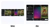
We’ve made creation flows more efficient by eliminating unnecessary steps.
Less is more. We’re systematically eliminating redundancy and streamlining how you navigate and create. Recently, we removed unnecessary steps in our Shorts creation flow, making the process simpler and helping people create and share more easily.
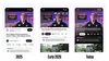
Ads no longer push down the video title, and we’ve redesigned the actions to make them more visible and fit together better.
We prioritize the consistency of the entire app over any single feature. This means using familiar icons, typography, and layouts so you always know exactly where to find what you need.

Experience your favorite Shorts on the big screen.
Whether you're watching Shorts on your phone or a documentary on your TV, the experience should feel familiar. We use shared design patterns and components so features work seamlessly across all your screens.
By sticking to these principles, we’re continually building a YouTube that looks better, works smarter, and feels like second nature.