A new way to find your favorite YouTube channels
Our redesigned icons make it easier to find your way around YouTube.
Mar 23, 2023 [[read-time]] minute read
Mar 23, 2023 [[read-time]] minute read
Welcome to the latest installment of our Innovation Series, a behind-the-scenes look at how the YouTube features find their way to your screen, as told by the people who create them.
From the moment you open the YouTube app, you’re interacting with our icons. These little markers serve as a kind of visual wayfinding, guiding you through the app so you can create content or find things you want to watch.
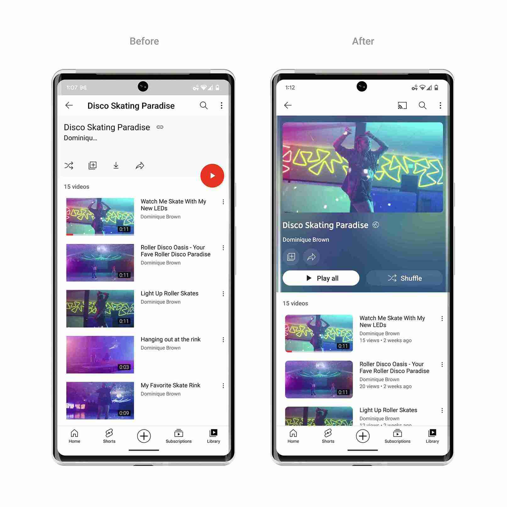
We recently redesigned over 450 system UI icons used across our entire platform!
While icons act as a visual expression of our products, services and tools, they also present a challenge. They need to be readable, consistent and clearly understood. And their limited size means they need to pack an informative punch into a small form.
With these goals in mind, we’re excited to announce that we recently redesigned over 450 system UI icons used across our entire platform! We also redesigned the topic channel avatar icons for our major YouTube official channels, making their colors more vibrant and their use more consistent. Here’s a look at what’s changed and a peek at some of these updated icons.
We use two types of icons in our apps: system icons and topic channel icons.
System icons are used in our navigation and other UI components. They’re designed to be simple, modern and friendly. Each icon is reduced to its minimal form, so that users across different languages and cultures can understand and navigate our products. Because they’re crucial to how people interact with our products every day, accessibility is our highest priority when we’re designing them.
Topic channel icons represent a specific type of video content or genre on YouTube. They’re most commonly used as avatar images representing YouTube-owned genre channels, like YouTube Live or YouTube Gaming. Because they symbolize a specific channel, they can be a bit more expressive than our system icons.
We started our redesign by tackling the system icons, auditing the entire YouTube platform to design a brand new set of graphics that could be used across all of our products. We especially considered how the icons would relate to user-generated content, their environment, accessibility, internationalization, symbology and file size.
We then explored different design directions looking at fully sharp angled icons and fully rounded icons. But we landed on a truly unique style that balances both sharp and rounded shapes, reflecting the range of serious to playful content that lives on YouTube.
Our icon buttons used to change color to indicate a change of state, often toggling between YouTube Red and gray. With our redesign, we wanted to indicate state without relying on color, so we made two assets per icon symbol. For most icons, the default is a one-pixel outline. Then, when the icon is active or selected, it either thickens to two pixels or fills the shape in.
This approach increases usability for YouTube’s 2 billion monthly users and counting, many of whom are colorblind or have low-vision. And because we no longer rely on color to indicate state, we were able to dramatically increase the contrast ratio of icons in all states to increase legibility.
After updating the system icons, we took a look at our topic icons. We wanted them to feel consistent with the system icons, so we used the same symbols in both types of icons. For example, we used the same light bulb symbol that we use in our UI navigation to build the topic channel avatar for YouTube Learning.
Besides tying into the system icons, we wanted to revisit our topic icons to reflect the latest design changes of YouTube itself. In previous versions, our topic icons were monochromatic. But now we’re making them more expressive, with bold colors that act as stronger visual identifiers for these popular categories of YouTube content.
Topic channels can be more visually rich than our system icons, which are usually in black and white to make them simple and accessible. So we used the redesign as a chance to create a more distinctive icon style, while still maintaining symbolic consistency across the icons. Topic icons leverage colors from our brand palette, featuring bright solid colors paired with vibrant gradients that reflect the spirit and energy of YouTube. This new look sends a clearer signal that these major channels feature exciting content curated by YouTube.
Now wherever you’re in one of our apps, you can be sure that you can easily find the content you love or the content you want to create because of YouTube’s iconography.