Skip to Main Content

Decoding YouTube’s new design language

As part of a longer-term modernization effort, we refreshed YouTube’s design — including our buttons and colors. What shaped these changes and how are we bringing them to life in a thoughtful way?

Welcome to the latest installment of our Innovation Series, a behind-the-scenes look at how the YouTube features find their way to your screen, as told by the people who create them.


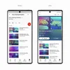
By now, you’ve probably noticed that YouTube looks and feels a little different. At the end of October, we rolled out a cleaner, more immersive design update which has, so far, been received positively.

From the beginning, we wanted the design changes to feel like a natural evolution of our product, so we embarked on a journey — creating hundreds of concepts and testing them with tens of thousands of users via research, experimentation and diary studies. Along the way, we got the data points to confirm, inform and finalize our design decisions.

To peel back the curtain a bit, let’s zoom into how we implemented updates across a few foundational elements and introduced a new visual pattern — ambient mode — to enhance our collections and watch experience.


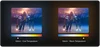
Rounded buttons and thumbnails

When YouTube was born 17 years ago, desktop web capabilities were not as advanced as they are today. Now, we’re designing for a much more complex and sophisticated interaction — whether that’s watching a full-screen video, swiping through photos or commenting on a post.

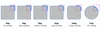
To kick off our visual update, we decided to address two highly visible elements in our ecosystem: buttons and video thumbnails. We began researching and testing things as small as pixel variations to create a friendlier and more tappable UI. Eventually, we confirmed our theory that rounded shapes do indeed feel more friendly, inviting and comfortable to tap.

Design Corners

That said, rounding objects in our UI was not as simple as picking a number and applying it to radii. We had to take a few things into consideration, like inset thumbnails and containers. So our lead designer on the Design System Team, Marshall Bock, came up with a rounding philosophy that scales the radii of the UI element with respect to its placement, size and relationship to other objects on the screen.

Color and light

Working on a video-first product, the team felt there was an opportunity to explore a concept that captured the magic of a theater experience.

Think about watching TV at night and how the room fills with brilliant, vibrant color. Your environment quickly becomes an extension of the source of light and transforms the dark space.

Think about watching TV at night and how the room fills with brilliant, vibrant color. Your environment quickly becomes an extension of the source of light and transforms the dark space into an immersive watch experience. We thought that was a really cool effect, so we explored several ways to replicate it within the dark theme setting of our product.


Where does the source of color come from?

Another challenge was figuring out the source of color while making sure the video and thumbnail remained the biggest visual influences on our watch and playlist pages.

To feel authentic, the ambient glow had to be inclusive of all colors used in a single thumbnail of an ever-changing video frame. We tried many different forms of color extraction, but as we dug into implementation, we felt that some techniques wouldn’t scale to accommodate our desired use cases.

So it was back to the drawing board and the answer was right in front of our eyes: thumbnails and storyboards (preview frames of the video shown during the scrubbing experience.)

More like this

We got excited and explored ways to use raw storyboard assets themselves, which we felt were truly the most accurate and authentic source of color. Collaborating with Engineering, we pulled, stretched, blurred and scrimmed the thumbnail and storyboard assets to deliver the ambient experience you see in our product today.


Low vs. High end devices

We wanted to deliver great experiences to high and low end devices, but knew that the extra load from the storyboard effect would be tough on some devices. So we turned to our new technology called “lithium” — which launched last year — and leveraged it to target experiences to specific device classes. But our low end device experience still needed an extra lift to imitate a neutral glow casted by TVs in a room.

One of our lead designers for the watch surface, Dominique Brown, came up with a great solution: Kelvin scales. We figured out how to map the Kelvin color temperature range to a color palette representing the aggregated cool or warm tones used in the video. When this neutral color is applied in relation to the video frame, the eye adjusts — perceiving more cool tones for cool frames and warm tones for warm frames.

More like this

Kelvin Scales

Cool to Warm

Beyond the numbers

Viewer feedback also played a huge role in our design process. Our UXR team pioneered a program mixing qualitative and quantitative methods to measure the experience of whether something feels more modern.

We had our users look at a control and our concept and asked them: does the change feel more modern, clean or appealing? When we ran dozens of studies, we saw a significant increase in our users feeling that the product hit these marks. For the first time, we were able to ascribe a value to aesthetics and visual design.

YT Design elements

What’s next?

We’re not stopping here. Next up, we’re focusing on foundational design patterns like improving balance and alignment through layout updates and deepening the ambient effect of color.

At the brand level, we’re excited to start identifying celebratory moments within the product experience to build a more meaningful connection with our users. Our goal, however, will remain the same: to improve YouTube’s products so that they feel YouTubey in the most natural way. In other words, we’re not talkin’ about a revolution — we’re talkin’ about an evolution.

Subscribe