Ready for our close up: An updated look and feel for YouTube
We're announcing new design elements and product features coming to YouTube.
Oct 24, 2022 [[read-time]] minute read
Oct 24, 2022 [[read-time]] minute read
Editor’s note by Neal Mohan, Chief Product Officer: When the first YouTube video was uploaded in 2005, YouTube had a search bar and a list of video tags on its homepage. Since then, you could say we’ve gone through some changes. In this latest installment of our Innovation series, we’re sharing a design update that will make YouTube more modern and bring new features to power the YouTube you know and love.
YouTube just celebrated its 17th birthday earlier this year and we wondered if it was time to give it a small makeover. So we gathered input from thousands of viewers around the world and heard there was a desire for a cleaner, more lively design that better represents what we’re all about.
Starting today, we are rolling out a new look and several features that offer a more modern and immersive viewing experience while also improving how users watch videos. But don’t worry, the same YouTube you know and love is still at our core.
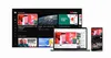
Color was a key theme for us during the development phase. We wanted to add vibrancy to our apps without detracting from viewers’ habits, whether that’s enjoying their recommended videos or browsing for new content.
After tinkering with several ideas, ambient mode came to life. And when the first design concept was met with overwhelmingly positive reactions from users during testing, we knew we were onto something.
Using dynamic color sampling, ambient mode introduces a subtle effect so the app background color adapts to match the video. We were inspired by the light that screens cast out in a darkened room and wanted to recreate the effect so viewers were drawn right into the content and the video takes an even greater focus on our watch page. This feature will be available on web and mobile in dark theme.
And while we’re on the subject, we heard your feedback and are excited to share that dark theme has been updated to be even darker so the colors truly pop on your screen. This will roll out on web, mobile and Smart TVs.
For those who pride themselves on curating the perfect playlist, we didn’t forget about you! Video playlists will adopt the same color treatment and now show more details about each playlist so viewers can easily jump right in.
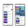
We know that the main reason you come to YouTube is, well, to watch your favorite content. So we’re making improvements to bring the focus back to the video player.
YouTube links in video descriptions will change to buttons, and frequent actions such as like, share and download, are now formatted to minimize distraction.
Now, we’re making the watch page easier on the eyes: YouTube links in video descriptions will change to buttons, and frequent actions such as like, share and download, are now formatted to minimize distractions. The subscribe button is also getting a touch up: the new shape and high contrast make it really stand out, and while it’s no longer red, it's easier to find and way more accessible to everyone on both watch pages and channel pages.
And we’re more than just our looks. After introducing and testing several new product features on youtube.com/new earlier this year, we heard from many of you wondering when we’d make these more broadly available. The wait ends here: we’re launching pinch to zoom and precise seeking to all users starting today.
With pinch to zoom, you can now easily zoom in and out of a video while on your iOS or Android phone. And when you let go, the video stays zoomed in so you can enjoy the rest of the video in greater detail. Give your fingers a rest!
Have you ever followed along to a tutorial on your phone, but needed to keep rewinding so you could master that one small step? Precise seeking helps solve this problem. Whether you’re on desktop or your mobile device, simply drag or swipe up while seeking to display a row of thumbnails in the video player and you’ll be able to make fine-tuned adjustments to get to the exact part in each video.
Precise seeking builds on our recent improvements to video navigation that help you quickly find the parts you’re most interested in. We launched the ability to long press anywhere on the player to seek and to double tap with two fingers to skip chapters. We also added a graph that shows frequently replayed moments in a video.
Feedback from our creators and viewers has always played an integral role at YouTube as our teams continue to think of ways to improve for our users; today’s updates were no exception. Over the next few weeks, these changes will gradually roll out to all users, so take the new design out for a spin and let us know what you think!
